The Chain Perspective brand.
A considered identity for independent digital-asset research. Clear in its thinking. Precise in its expression.
Evidence is our starting point.
The identity expresses disciplined inquiry, international awareness and a measured view of risk.
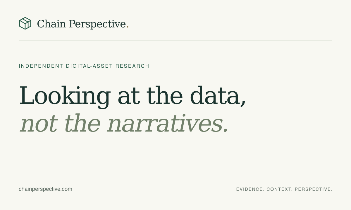
Looking at the data,
not the narratives.
Positioning
Chain Perspective is an independent digital-asset policy and market-structure publication. It serves professional readers with Hong Kong and US focus markets in global context.
Audience
Professional readers, researchers and market participants. Hong Kong and the United States are focus markets within a global perspective.
Promise
Explain what changed, why it matters and what remains uncertain. Let the reader inspect the evidence.
The public offering is research and reporting. Investment-management ambitions do not establish an active fund, permission to manage client capital or a verified track record. Public product claims must reflect confirmed capabilities. The Professional page invites pilot enquiries; proposed team functionality is clearly separate from the public research available today.
One name. One recognisable mark.
Use “Chain Perspective” in title case. The legal publisher name remains chainperspective Reader Technology Limited.


Clear space & scale
Leave at least half the symbol’s width around the lockup. Use the full wordmark at 180 px or wider. The symbol can stand alone at 24 px; the favicon is its small-format exception.
Keep the geometry
Keep the cube, lettering and final dot in their original proportions. Use the supplied monochrome variants. Do not stretch, rotate, add shadows or substitute a coin symbol.

Quiet colour. Clear hierarchy.
Ivory is the main canvas. Forest carries the identity. Sage and gold provide restrained accents.
Ink
#1C3530Headlines, body text, primary buttons
Forest
#285A47Links, icons and interactive emphasis
Ivory
#F8F8F2Default page background
Mist
#EFF1E7Reading notes and secondary surfaces
Slate green
#5C6A61Secondary copy and metadata
Sage
#72816BLarge display emphasis only
Bronze
#7D683CSmall accent text and focus rings
Gold
#9B8756Decorative details; not body text
Supporting tokens: border #D8DDD2, inverse text #C5D0BF and white #FFFFFF. Gold, borders and pale surfaces are not text colours.
Use ink, forest, slate green or bronze for small text on ivory. Sage is reserved for large headings. On dark forest, use ivory or inverse text. Check actual foreground and background pairs when adding a component.
Editorial authority, everyday clarity.
Two system font families keep the experience fast, consistent and independent of third-party font services.
Looking at the data,
not the narratives.
Aa Bb Cc Dd Ee Ff Gg Hh Ii Jj Kk Ll Mm
0123456789
Research begins with a question. The source, date and uncertainty should be as easy to find as the headline.
| Role | Desktop / mobile | Style |
|---|---|---|
| Hero | 48–68 / 34–46 px | Georgia regular · 1.08 line height |
| Page title | 44–58 / 34–46 px | Georgia regular · 1.12 |
| Section title | 30–38 / 28–34 px | Georgia regular · 1.2 |
| Story title | 23–30 / 21–25 px | Georgia regular · 1.25 |
| Reading text | 18 / 17 px | Georgia regular · 1.85 |
| Body & forms | 16 / 16 px | Arial regular · 1.65–1.8 |
| Card summary | 14 / 13–14 px | Arial regular · 1.75 |
| Metadata & labels | 11–13 / 11–13 px | Arial · restrained tracking |
Fallbacks: Times New Roman and serif for display; Helvetica and sans-serif for interface. Reserve italics for a brief point of emphasis. Never set paragraphs in capitals.
Space is part of the hierarchy.
Compose around a clear reading order. Use rules and alignment before adding boxes.
Desktop
A 1,280 px maximum canvas, 48 px outer gutters and a 760 px article column. Use two columns for research lists, with a secondary rail only where it helps reading.
Mobile
Use 20 px gutters, reduced to 16 px on very narrow screens. Collapse to one reading column. Use a compact header and keep the menu scrollable within the viewport.
Surfaces
Prefer ivory pages, mist reading notes, thin rules and square corners. Radius is 0–2 px for controls; avoid decorative shadows and floating promotional panels.
Density
One main action per section. Keep article context beside its title. Use 32–64 px between major sections and 16–24 px within related content.
Useful actions, stated plainly.
Links say where they lead. Buttons describe the result. Every control needs a visible state and a keyboard path.
Interaction rules
Keep tap targets at least 44 × 44 px and form text at least 16 px. Use a visible bronze focus ring. Support keyboard navigation, Escape for menus and reduced-motion preferences.
Honest states
Use “Saved”, “Try again” and specific next steps. Do not show a successful signup before it is saved. Newsletter consent is explicit and unchecked by default.
Explain systems. Never invent evidence.
Editorial illustrations use a controlled forest, sage and gold family with simple geometric forms.

Editorial artwork
Use distinct compositions tied to the subject: payments, assets, permissions or infrastructure. Use generous negative space. Preserve the original illustration caption and meaningful alt text.
Charts & photography
Charts need real observations, labelled axes, dates, units and sources. Forecasts and scenarios must be marked as such. Photographs need provenance and appropriate usage rights.
Avoid decorative upward price charts, unlabelled performance figures, invented trading screens, generic crypto coins, neon gradients and generated photographs presented as reporting.
Measured, specific and inspectable.
Lead with what happened. Attribute claims. Give readers the distinction that changes their understanding.
“The pilot tests settlement outside conventional hours.”
A concrete statement with a defined stage and scope.
“A revolutionary platform changes finance forever.”
Unsupported certainty, promotional adjectives and an undefined outcome.
Illustrative copy examples, not new reporting.
Writing principles
Write original English. Use short paragraphs, active verbs and explained technical terms. Distinguish evidence from interpretation, proposals from law, and announcements from delivery.
Depth earns its space
Prefer detailed explanations and multiple relevant primary sources when available. Do not pad short developments, duplicate sources or imply independent corroboration from one issuer.
Retain event dates, publication dates, primary-source links, verification limits and AI-assistance disclosure. A visual refresh never removes this context.
One identity across every touchpoint.
Adapt the composition to the channel while keeping the name, line, colours and evidence standards consistent.
| Touchpoint | Required treatment |
|---|---|
| Website | Shared wordmark, compact navigation, ivory canvas, serif hierarchy and source-linked articles. |
| Newsletter | The Daily Perspective; Chain Perspective wordmark; the original slogan; dated story links; publisher identity and unsubscribe control. |
| RSS | Chain Perspective plus the topic label. Access requires newsletter email opt-in; withdrawal revokes the private feed link. |
| Social preview | Wordmark and slogan on ivory. Article-specific previews use the article’s original illustration. |
| Research reports | Title, author or automated-desk identity, publication date, version, sources, assumptions and limitations. |
| Future video | Wordmark opening, readable captions, dated source references and disclosed synthetic media. Use sourced charts rather than decorative performance claims. |
| Technical guides | Same reading system and disclosures. Homelab remains inside Learn; no standalone Homelab RSS. |
Email editions are awaiting launch. Newsletter delivery requires the configured provider, confirmed addresses and verified sending-domain setup. Brand assets do not activate that service.
Make consistency repeatable.
Use the shared implementation as the starting point for every new page or channel.
- Use the approved name, wordmark and original slogan.
- Use shared colour and typography tokens; avoid page-specific palette drift.
- Keep a single page-level heading and a logical reading order.
- Check text contrast, visible keyboard focus, 44 px targets and 320–430 px mobile layouts.
- Test links, forms, empty states and loaded images before publishing.
- Keep source dates, uncertainty, corrections and automation disclosure visible.
- Preserve email consent, private RSS access and the low-profile Homelab collection.
- Describe only verified products, capabilities and business status.
The written specification, design tokens, shared interface and downloadable assets live with the project source. Changes to the system should update the guide and affected components together.